Downtown Nutrition
Identity Redesign

Downtown Nutrition is a local juice & smoothie bar that aims to sell a variety of on the go drinks for the urban people.
When brainstorming ideas for a new company logo, it was important to experiment with a variety of different styles. Originally a more stylistic approach was chosen upon until further research pointed towards their company goals & key values.
Key Words: Vibrant. Passionate. Friendly.
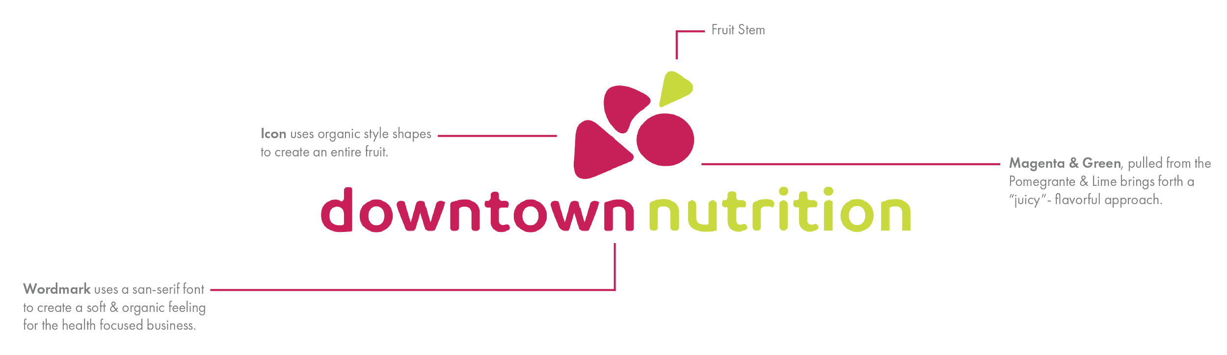
Logo Breakdown
The Logo(s)
A lockup is a combination of a logo and its accompanying text or tagline.
The lettermark is a logo made up of initials or letters, typically the brand's acronym.
A logomark is a symbol or icon that represents the brand, often without text.

Alternate Lockups(s)

Each alternate lockup was designed to replicate a bowl of assorted fruit.
These designs are primarily used for stickers and other product merchandising.
Left to right: Raspberry, Orange, Lime


Early logo design exploration
